
Hi Folks:
Yes, I’m aware I haven’t yet posted part two of my ‘Making Panoramas in the Rainforest‘ post. It’s coming. Truly!
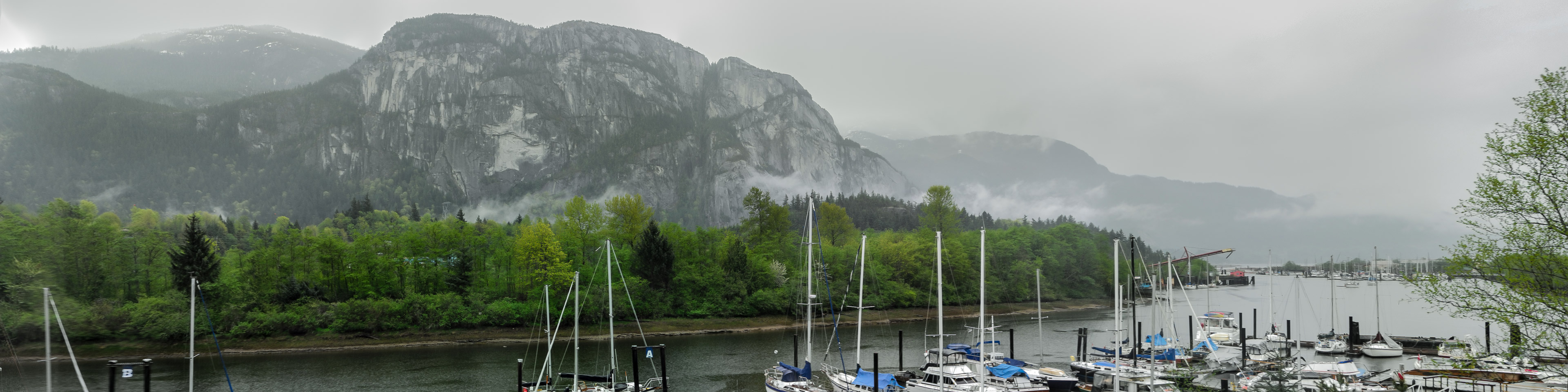
Okay, the idea for this post came from a couple of sources, but most notably from an image I made recently with my phone camera. I have a Galaxy S21 phone, and in pro mode it allows me to shoot in raw/dng format. I can open those images in Capture One as raw files the way I would any other.
Before we continue I want to reiterate a couple of things. Those who have read our previous posts will be familiar with them. The first is a reminder that digital cameras don’t capture images. Digital cameras capture light as information, and we can take that information and arrange it in such a way that it looks like an image – either on screen or in a print. This happens because we arrange that information into a grid of little coloured dots (on paper) or little boxes (pixels) on the screen. Continue Reading →
